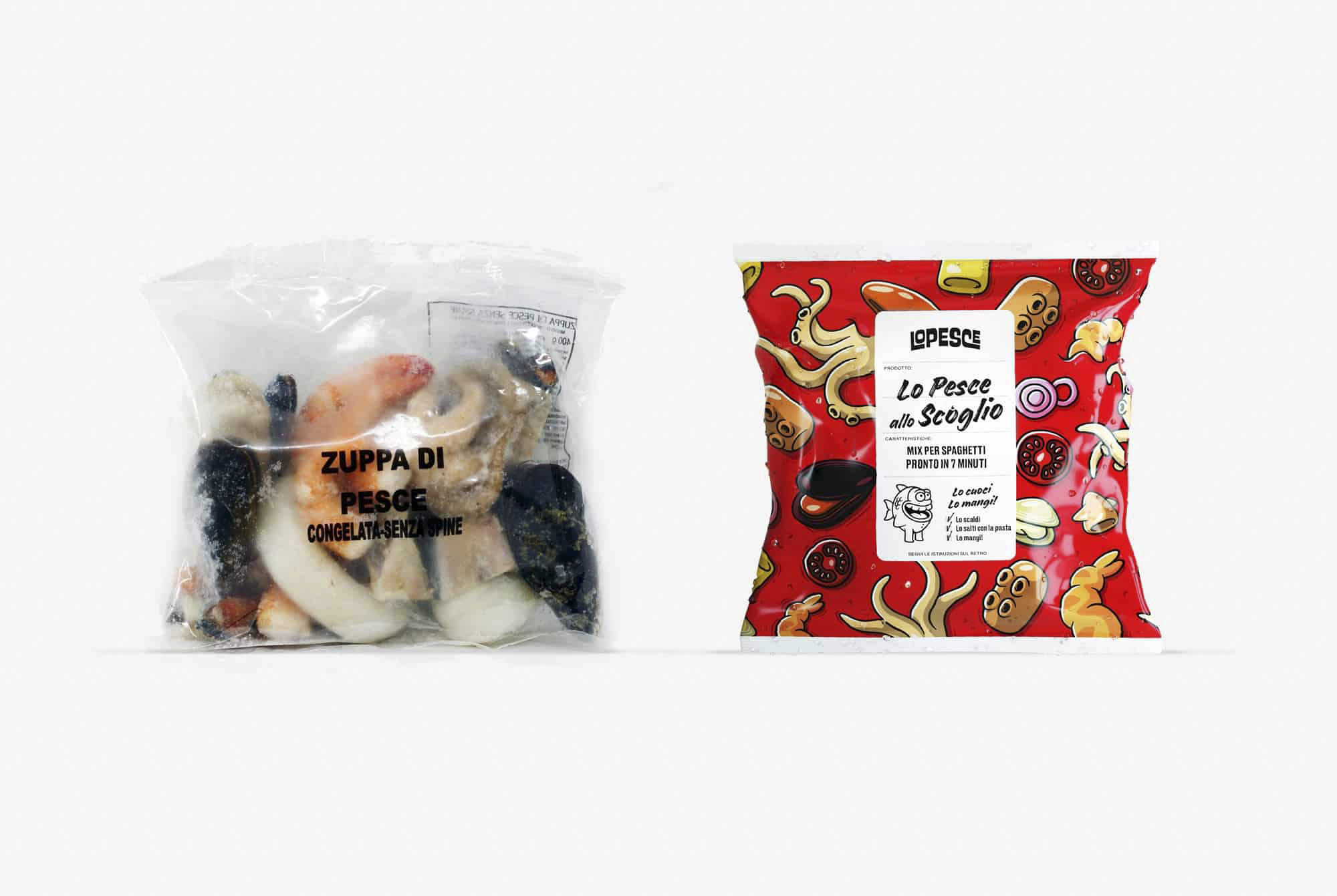
Xilo, an Italian producer of frozen seafood products, needed a solution to gain positions in supermarkets. How could this be done?
The refrigerated shelf section tends to be rather bleak. The fish market, on the other hand, is truly enjoyable: the shouting, commotion, characteristic smells and confusion. Having to create a brand from scratch, we decided we wanted to recreate that mood.
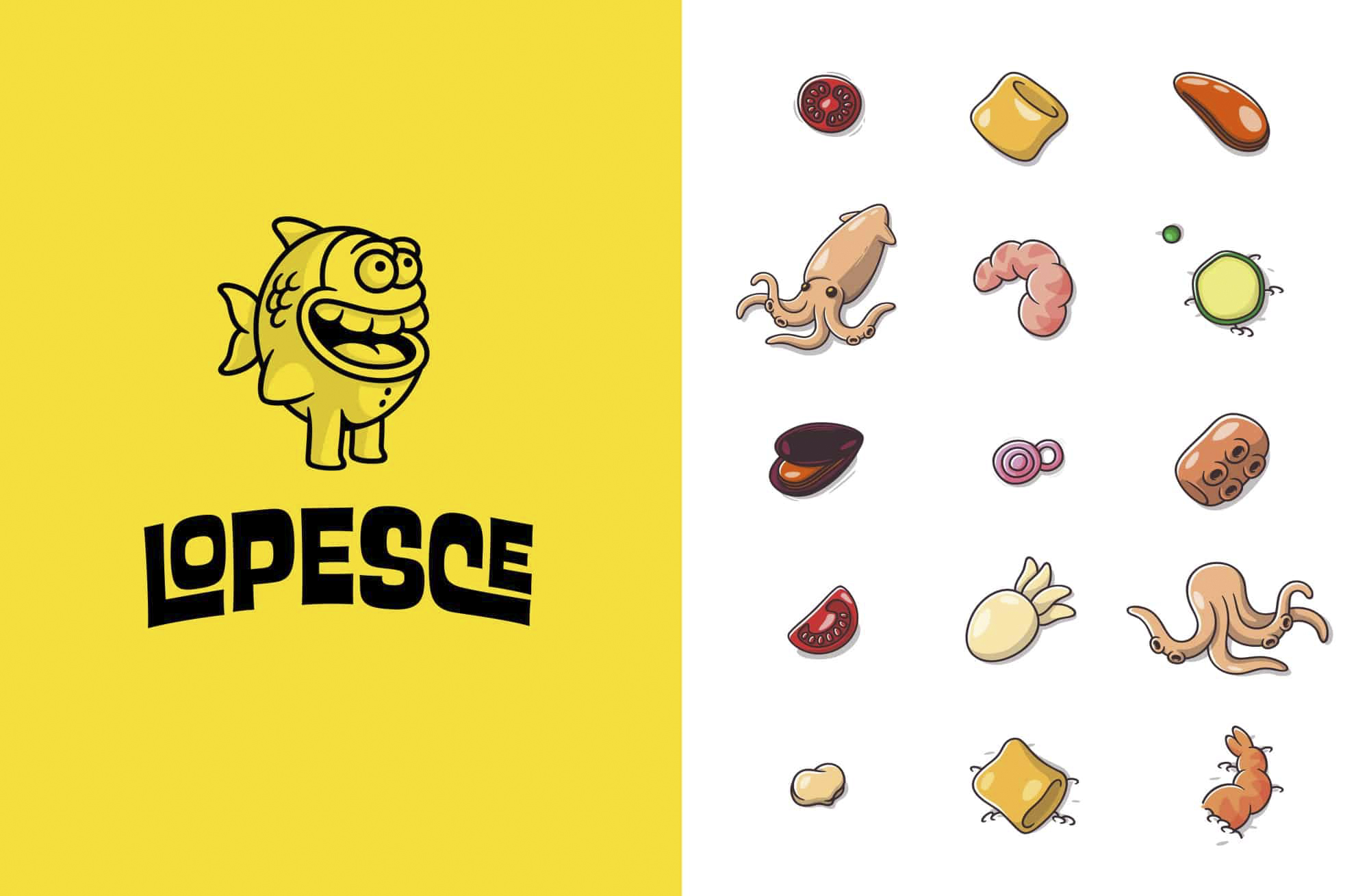
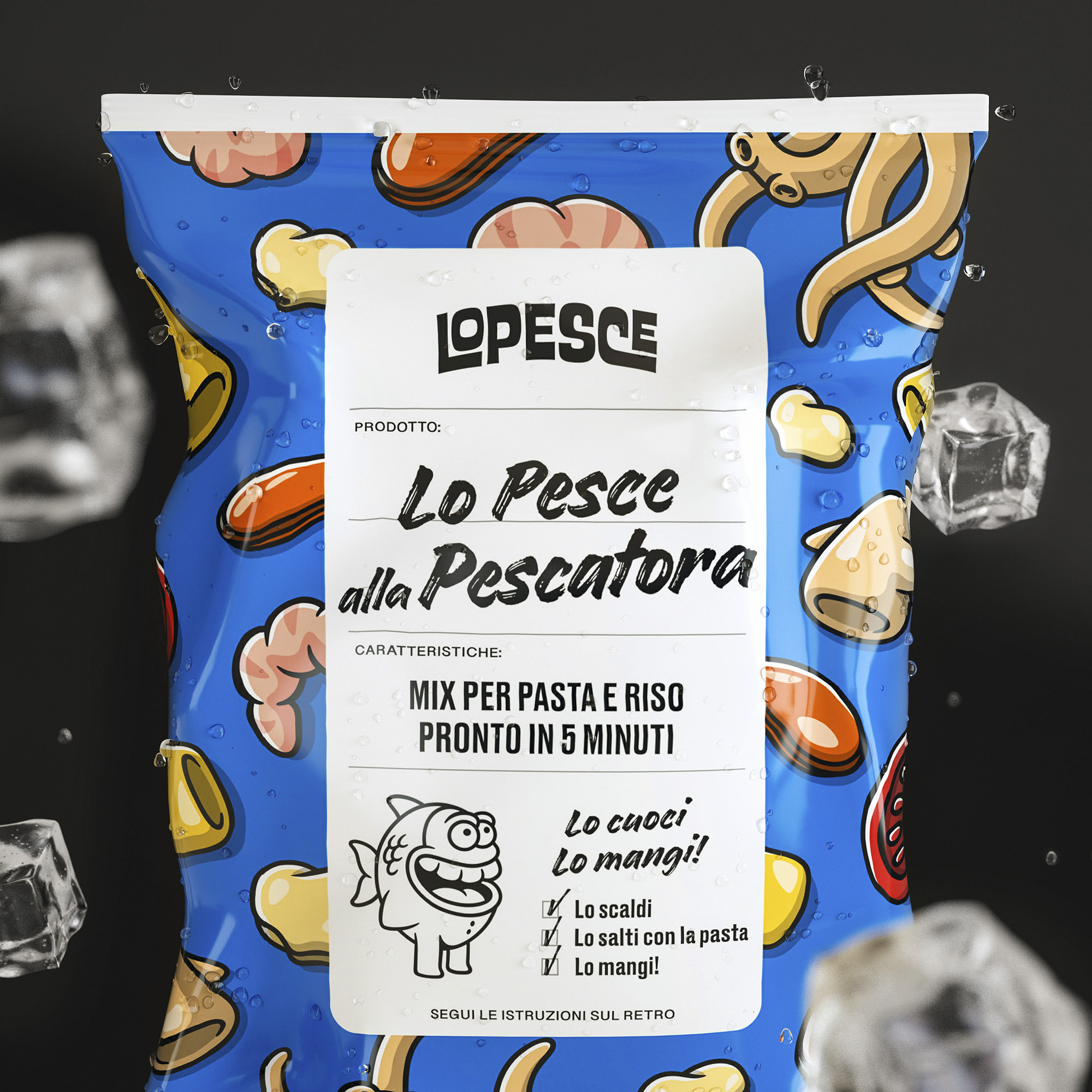
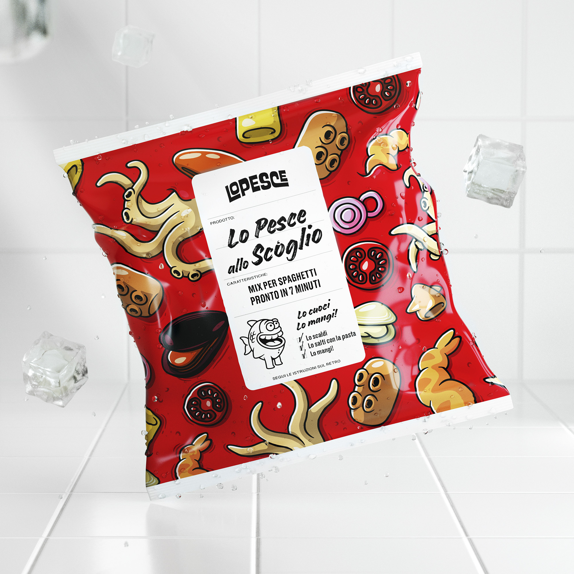
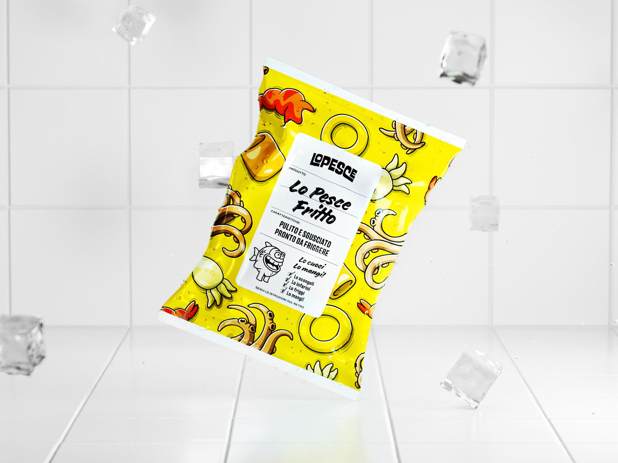
The new brand is called ‘Lo Pesce’: an easy-to-remember and popular Italian name.
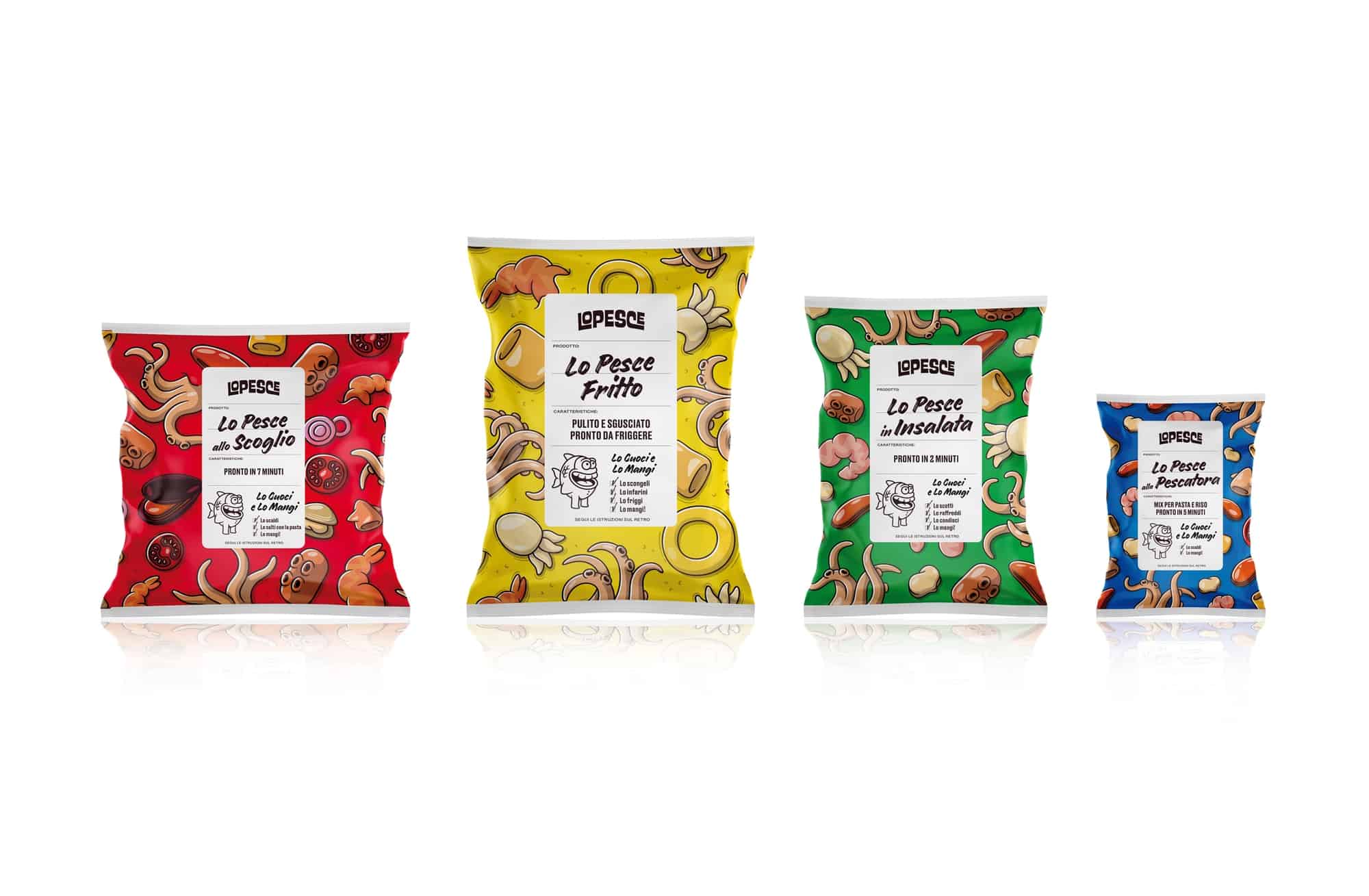
Lo Pesce’s image is colourful and self-deprecating.
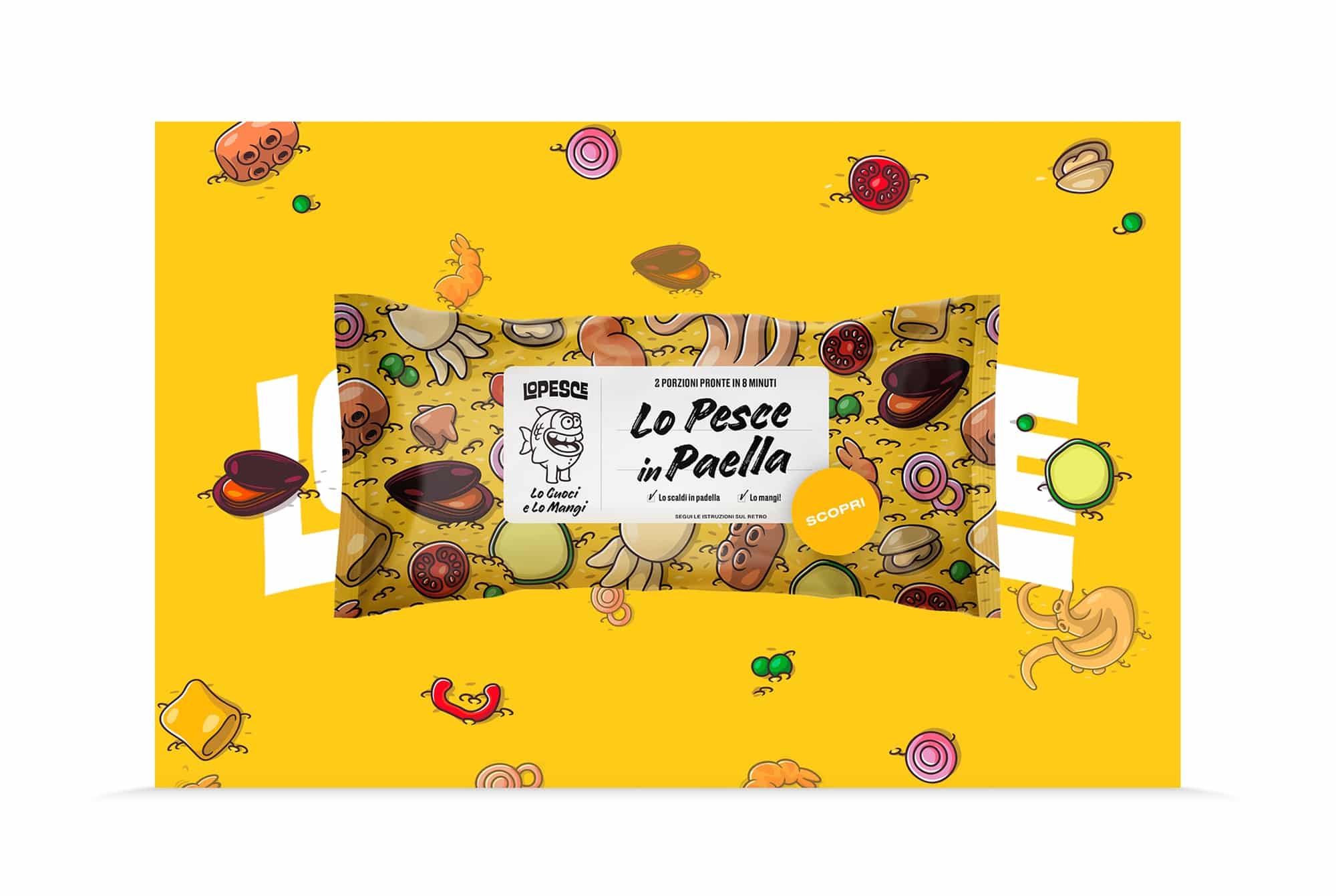
Using Elia Colombo’s illustrations, we designed an illustrated pack system, telling the story of each product through an aesthetic inspired by Italian comics from the 1970s, adapted to digital needs and made “Instagrammable”.
Lo Pesce therefore becomes the brand buddy for students, young couples, inveterate singles and busy parents. A line of seafood products designed for millennials.
